Saturday, September 15, 2007

Narita Japan


Here's a few more photo's for thoes who are interested:


I'll try to keep uploading a few at a time, every so often, so keep checking periodically!

Monday, June 18, 2007

Indonesia


Masa Inn in Kuta, Bali (Buddhist Temple)

Saturday, May 12, 2007

Resubmit "Steve Mann-type Eye Piece Flash image"


Description: Brightly light shot with detailed urban background

Intentions: Documenting local destruction while attempting a self portrait

Good/Bad: My head tilt is too extreme- not natural or relaxed. Although my expression and the flash-fill lends itself nicely to this image, as I just barely stand-out from the wooden frame behind me.

Evaluation: I find this image to be more pleasing and less eccentric than the last flash fill excercise with Emily and the eye apendage.

Resubmit for "Easter snow sticking around"


Intentions: To mimick Andre Dubois' technique although I used a digital camera that won't go wider than 18mm although that's 27mm in SLR language so I can't totally achieve his effect. I really wanted to explore the passage of time aswell by showing both day and night of a space which has been documented many times over the past three decades with many types of technology.

Description: I had to use a series of three shots whereas Dubois uses only two- due to his wide angle pin-hole camera. My images curve outward whereas the Dubois shots curve inward toward the viewer enveloping them. My shots repel the viewer to the extreme depth of the city street right off the frame.

Good/Bad: The exposure for the night shots could have shown more detail in the shadows and some of the highlights of store signs are blown. I really enjoy the concept of passage of time and/or seasons- even if it puts into a category of elderly photographers I'll be happy to join them on this boat!!

Evaluation: In the day images I showed the sky and cityline of buildings whereas in the night shots I focused on getting the action taking place on the street and didn't think about the skyline. This is 'my' little corner of Montreal and I adore the gritty-urbanscape!

Wednesday, May 9, 2007

fooled ya-more posts to come...


Andre Dubois a prominant Montreal Pin Hole photographer and past developer of prints for commercial photographer's in 70's to 90's at St.Catherine Apt where I now reside.

I had the good fortune to meet Andre and his wife Barbara while they visited my apartment (their old apt.) around St.Patrick's Day to take an image from his usual locale through his studio window (now a bedroom) towards St.Catherine St. He was generous to leave images he developed in the old dark room that he took with a pin-hole camera of the apartment and surrounding area's in the 80's. These are some of the images Dubois has donated to the apartment:
Intentions: To capture a full city block

Description: The beautiful aesthic of pin hole comes through with a slight vingetting around the edges and the shadows created by the trees give texture to the flat cement. The slight distortion of the wide angle lens creates two sides to the image and a pyramid type shape created by the skyscrappers and apartment buildings increases feeling of depth.

Good/Bad: The repition of the cars and windows of the buildings are impressionistic. Especialy with the high contrast between the sky and deep shadows created by natures canopy on the road. Surrealism is encorporated by combining two wide angled images into 1 picture gives the viewer a sense they are looking at something they'd never be able to see with their own eyes. I'd want a bit more detail in the shadows of the builgings and I'd like to see some human life mixed in with the architectural and commercial aspects of the urbanscape.

Evaluation: I'm more than impressed with his work and I'll be visiting his exhibit before jetting off on a 25 hour journey to Indonesia (Bali and Lambok) and I suggest all in class go to this:

Tuesday, May 8, 2007

Polarscanography

I attempted to use polaroid (600) film in a camera that took a larger format image and then I tried putting 600 film into my Joycam that takes 500 and both ways didn't turn out an image. The way I put the film into the camera could have been the issue or possibly it's just not the right type of film.
In a dark room I opened the cartridges of 20 polaroids and placed one at a time into the camera, since the cartridges weren't the same size, and only the polaroid on the bottom left of the scanned image actually showed up traces of light all the other 19 images didn't register any photons!

Getting away from what didn't work... I decided to use a camera-less image for my last post encorporating many tools and mediums used in photography. I also encorporated some found objects by adding the half glasses frame and the 50 cent piece. The money might seem out-of-place although I was thinking about the $30 I spent on the polaroid images that are now yellow-green framed squares that I'll have to encorporate into I mixed media painting so that they don't go to waste. The glasses are 3D which reflect our experiments with David at the beginning of the semester and the slide images are of my Visual Communication classes with Claude Martel in 2004!

Wednesday, May 2, 2007

Feminism needs a new charge


Linny's image of a friend during a 'crazy' and so-called 'pathetic' shoot to achieve the most down-trodden women possible. The large glasses really help to reflect idea's of self-loathing and an anti-aesthetic.I believe more women should adopt an anti-aesthetic instead of pleasing the men in society by being a piece of meat to gaze at. She looks away from the camera as if she has limited self-esteem and would rather not look at us, although she seems to be used to be stared at as her body posture is resigned and slumped towards the camera. The distortion of having a wide angled lens pointed towards the face at an angle creates tappered distortion so her legs are minature compared to her body which also helps to create that anti-aesthetic that really is intriguing.


Mustafa Ünsal's photo of Julia shows a different aesthetic achieved even though the view point and subject matter are almost identical. Julia confronts the camera in a classic style of fashion photography and her pose shows deliberate contortions as she holds her body in place to achieve that flirty "look at me" character. I really enjoy the graphic out-of-focus floor tiles which creates texture within a shot that's mostly smooth lines in the chair and skin.

Tuesday, May 1, 2007

Alex as Andy

Alex (Group 1) Shot this image with a film camera, inverted in PS, and played with in layers. The repeated patterns of squares of the window frame and negative spaces amoung the background windows are reminescient of Pop Art and Andy Warhol's reproduction style. I like the strong colours and can see this image as a postcard advertising Montreal modern abstract architecture. The only aspect that could be changed is the darkness in the hues, I'd like to see more white/light coming through the windows. Graphic-ing Fun!

35mm Pentax K1000


I've finally experimented with my film camera again here's a few of the recent shots. The eye poster being my favorite because of the illustration. The funky smoker by the flowers was a roll gone wrong and after I scanned the negative, inversed and played with adjustment layers in photoshop I came out with a photo I don't remember taking at all!


This last image is more flash experiments that I did with my Pentax and Vivitar where I tilted the flash at an angle to feather it's strength towards the right hand side of the frame which accents the earth rising in the background.

Note: I keep looking at the back of my film camera to see the non-existent LCD screen and feel foolish each time I do it- am I alone in being trained to look at the back's of camera's as if they hold the answers!

Wednesday, April 18, 2007

Reflections-last digital images


Past Reflections to go with the previous research, except all these images are from my journeys to Vancouver, and not other peoples images.


Interior reflections snapped as I noticed my roommates microwave was reflecting the kitchen and surroundings, within it's graphic frame. I was also testing David's theory regarding focusing on reflections that are farther away than the object within the frame that has the reflective surface. I had to focus at a 7 foot distance to achieve a sharp reflection while losing the focus on the microwave which was 2 feet away.

Class trial-Sunny day with Flash


More fill flash trials!

Reflections


Description: Reflections

Intentions: to find examples of reflections

Good/Bad: all are good to me, no bad elements- except adding more details to the blacks

Evaluation: a bit too conventional I'll look for more tension causing and experimental shots next time:)

Wednesday, April 11, 2007

Flash Trials


Description: Medium portrait of Emily Hull experimenting with my new eye apendage which is a Steve Mann-type invention. The eye apendage has multiple uses and the design allows the user to decide it's function on any given occasion. Emily is trecking out into the urban wild to learn more about these humans we call city-folk!

Intentions: To use flash in a composition that would normally be reserved for studio portraiture. Also I'm attempting to create an intriguing image like that by Diane Arbus and other photographers who use on-camera flash to fill-in their subjects and highlight certain elements in the frame.

Good/Bad: The flash creates a flat lighting effect so I could have asked Emily to turn her shoulder to the camera to create more depth and intrigue. I could have experimented more with covering the flash in area's to highlight certain parts of her face and avoid lighting the background.
I really like the effect of the orange lights which creates a warm glow around her (no colour correction attempted). Also her smile is coming right from her and not coaxed by me at all because tow homeless men had just passed by and made some cute comment about Emily's head-gear that she just had to break out in that fabulous smile!

Evaluation: I want to experiment again with flash by creating a higher contrast between subjects and backgrounds which being more selective about where the fill flash should fall.

Unnatural Flash-Mary Ellen Mark


Amanda and her cousin Amy, Valdese, North Carolina, 1990
All photographs ©Mary Ellen Mark / American Odyssey, Aperture, 1999.

Description: Mary Ellen Mark was documenting American lifestyles in the modern times using Diane Arbus' style of on-camera flash and Dorothea Lange's style of societal documentation from the 1930's depression era who documented the poor conditions of the migrant workers for the F.S.A. (Farm Security Administation).

Intentions: To show the character and attitudes of young women within their 'natural' enivronment.

Good/Bad: The placement of the pool and background objects compliment the subjects to create negative spaces and breaks up the monotony of a soft focused dark background. The characterizations of the girls which are shown tell so much about their personalities, the rebel smoker versus the shy, follower who cautiously won't be sucked into dangerous activities unlike her cousin who will probably try anything once!

Evaluation: I really like the concept and composition of this image. The social idea is shocking to see a young girl smoking, and it seems like she's emmulating her mom's behaviour or that of a women that she greatly admires and wants to become.

Tuesday, April 10, 2007

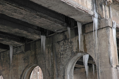
Easter Snow sticking around


Description: Close-up of the Atwater Bridge

Intentions: To show how the ice clings to the cement and the difference in texture created between the rough concrete and the smooth bright ice

Good/Bad: needs a focal point, or more space around it to show the conxtext of the ice, perhaps a train passing on the bridge would have been a complimentary subject that could have been used as a focal point. I enjoy the dramatic effect of large pieces of falling ice and the organic nature of man-made objects clash nicely with the geometric and naturally created ice sculptures.

Evaluation: Getting a ladder and being closer (i.e 1 foot away) to the ice and having a shallow focused image of the ice with the bridge in background would have been more effective to emphasize the fact that the man-made objects are less important than the natural sculptures. With this angle I'm emphasising the linear lines created by the bridges composition in contrast to the strong and bright columns holding the scruture from falling. In contrast the ice has no support against destruction and will fall down eventually alluding to the passage of time.

Wednesday, April 4, 2007

Animation- Class Activity


Using Image Ready I've animated a series of shots from the Dawson atrium up to the 3rd floor. This is the same path as the Shooter from Sept. 2007 at Dawson supposedly took to get to the cafeteria- just as a side note!

Classmate Critique's


Maverick's Shot near Atwater and Fort St. 2007

Description: Moment between two homeless Natives chilling by the native graffetti wall
Intentions: To capture the rawness of the men who are weathered by the elements
Good/Bad: Great tight composition, although needs to be lightened to bring out more texture in the skin tones of the men
Evaluation: I really want to do a Documentary on the homeless people in this section of downtown and I appreciate anyone who takes the time to notice them- as I'm sure they enjoy the attention and acknowledgement as well!

Lino's Old Port Shot 2007
This shot is similar to my Old Port Post 2nd image, great minds think alike!

Tuesday, April 3, 2007

1st Canadian Female Surrealist


Clarence White photograhed by Margaret Watkins, 1923

Description: Sepia tone is due to the printing process since Watkins abannoned the silver gelatin print for palladium printing paper. The shallow focused image really helps to reduce background clutter and allow the reader to focus on the subject.

Intensions: to have a strong composition where the viewer can see aspects of the person's character by their placement and stance in the image.

Good/Bad: Shows how White is connected with nature while still sticking-out and being an individual through the clutter that surrounds him. I would have liked to see both eyes of the person to get a better feeling for their character and less of their surroundings.

Evaluation: Very strong image created by the placement of legs, arms and clothing which match the tree and seem to be the foundation for White- as he leans heavily into the trunk to survey his surroundings, in relaxed anticipation of a great event that will occur any minute.


Margaret Watkins (1884-1969)
Self-Portrait 1919, Glasgow

"[Clarence] White hired a woman, Margaret Watkins, to teach advertising photography at his own school of photography in Manhattan in 1914- at the time [when teaching photography] was thought to be exclusively a male dominion. Women also formed a significant proportion of the membership of Pictorial Photographers of America, organized by White and Margaret Rhodes Peattie in 1916; in the year after its founding 53 of the 157 members were women" (109).

[Rosenblum, N. 1994. A History of Women Photographers. New York: Abbeville Pub. 109, 159-60, 324, 346, 159 p.]

Place Jacques Cartier- Old Port Montreal


Description: Image is very graphic with intersecting lines and organic architecture that overlaps and reduces the depth between the ornament on the stairs and the building on Notre Dame St. in the background.

Intentions: Wanting to capture texture and detail at the Old Port

Good/Bad: The parrellel lines of the structures are very strong and pulls the eye to the upper left corner and back down to the crest on the bronze ornament. Tones are mostly midtones which gives an even feel therefore more contrast could be added using photoshop.

Evaluation: This shot is a slightly shallow focused image and really leaves a mark in my mind right after I 'snapped' it I knew this image had strong graphic lines.


Extra black and white images of close-up details at the port.

Tuesday, March 27, 2007

What happens in Whistler...


Description: Clean compostitions (a.k.a. not too much clutter) with obvious focal points.

Intentions: Travel log photo documentation

Good/Bad: Lighting conditions could have been more dramatic, although with the overcast day I had to work with a diffused glow of reflected sun that spreads evenly over the scene. I enjoy the focal length chosen because I've decided to included more of the world in my framing and only use the 70mm DSLR lens (equal to 105mm SLR) if the scene warrants a close-up.

Evaluation: Moments in time are caught by the activity of archiving- I feel compelled to capture the scene-exactly as I see and feel the environment to be without adding more shadows or lightening up the shadows too much. I want subjectively accurate reproductions and feel I've achieved this goal on my trip out West.

Critique over the Break


Ralph Gibson's photo of Mary-Ellen Pucci

Description: Dramatic intensity, the viewer is drawn into Mary-Ellen's eyes.

Good/Bad: The triangular-geometric patterns of shadows falling across the subject is minimal in it's composition which compliments the busy graphic design of Pucci's shirt and curly hair. The part I like the minimal background also bothers me at the same time- I'd like to know more about Pucci by what background she chooses to place herself in.

Intentions: To create an image of tension where we think we know Pucci by being able to see her eyes although we really don't know anything about her character and preferences.

Evaluation: Gibson is able to compose an image that's minimal in it's complexity and seems as if he hasn't worked to get the shot- which I know is a false assumption because to get a dramatic photo one has to put alot of pre-planning and production energy into the shoot!

Jennifer Delgaty's photo of Marie Penner
at Whistler Mountain 2007

Monday, March 12, 2007

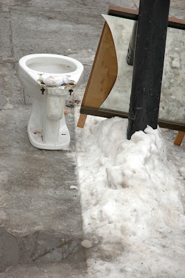
Duchamp-ish and Found Art


Description: Found art items that were discarded on the sidewalk really intrigued me. The snow that reflected in the mirror contained more detail than the 'actual' snow gathered around the light pole.

Intentions: To disrupt the viewer's definition of what is art- I'm following in DuChamp's greatly grooved path of finding everyday objects and seeing them as extraordinary and worthy of archiving in a photograph.

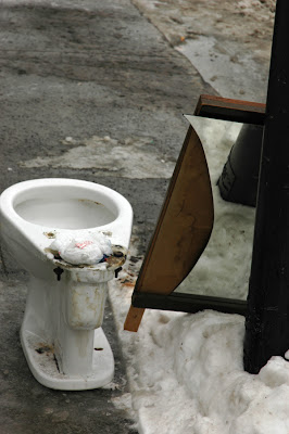
Good/Bad: The monochromatic colours within this image almost make it a black and white- except for the wood backing for the mirror which is showing, due to some careless or violent actions that lead this mirror and toilet to be discarded for the endless heap of unwanted consumption we term, a 'dump.' My point of view or vantage point could have been heightened in intrigue. Now that I see the framed image I'd want to re-shoot with my back or front on the ground looking upwards at the toilet and mirror to make them larger than life, and possibly catch my reflection in it's surface to add tension to make the shot more interesting.

Evaluation: The image is a bit bland and washed out due to the high presence of midtones, so I've included this secondary image which has more contrast and tension around the stains of the toilet and the stained snow behind the abandoned bowl- gross! Also, the brown mucky water in the street's gutter, behind the bowl, is reminiscent of toilet refuse and junkyard rain water as it collects and molds around the discarded 'gems and jewels.'


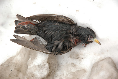
One person's trash is another person's beauty. This bird died... how? Was it a car, a window, the cast iron fence I found it laying in front of, or an animal that got at it's neck... who knows, it was there for only 2-3 days before I suspect some local dog had a nice snack!

Wednesday, March 7, 2007

Wild Card- Anything on Web

Description: Man Ray has amazing aesthetic and his surrealist art is an inspiration- along with other photographers of the time (Margaret Watkins- Cnd). His use of negative space is ingenius as he crops his hair, hand and arm to create interesting spaces of solarized grey in between his solid body that takes attention away from the solid subject.

Intentions: To have the viewer's eye be torn between the negative and positive spaces that his form creates within the frame. Also, he's experimenting with the printing process of solarization to achieve an effective blown background while still keeping detail in the whites and skin texture of Man Ray.

Good/Bad: Very effective and interesting as tension and interigue are created in the frame. I can even notice the tripod he was using for the shot just under his thumb.

Evaluation: I see this portrait as showing Man Ray intent in his work, he must have been a driven person who didn't sway from his chosen path unless given a good push. I would like to see his eyes, although I don't feel like I'd get any more information than I learn from seeing him work with his camera. I see his eyes as being represented by the camera lens, so the viewer is forced back into analyzing Ray's work to gain insights into the man himself.

Self-Portrait with Camera, 1930
4.25 x 3.25 inch
(vintage solarized silver print)

Tuesday, March 6, 2007

PS Experiment

I'm practicing with layer masks in Photoshop and have used this idea as a trial for the merged (3 in 1) shot for Photo Tech II. I originally wanted myself to be getting into a fancy dress although my unwillingness to expose my whole body and face on camera increased, until I decided to work with the sweater idea instead. I find this image has a lot of problems with lighting consistency as I moved my light source around in between frames to capture the best 'mood' lighting as possible on my face and arms. The two back people are full of volume and have a medium amount of contrast between highlights and shadows although the front face (fully clothed) lacks depth and volume (i.e. flat light) so it breaks the mood and continuity of the image. I'll have to watch this shifting, changing light pattern for my final shoot!
The composition is effective as the folds of the sweater guide the eyes around the frame in a clockwise direction. I enjoy having myself floating in space (i.e. black background) because it enforces the idea of surrealism since it's unlikely that photographers could capture, within 1 frame the movement of dressing, without the image being a long exposure- therefore soft focused with trials of motion. I also had issues with soft focus, on the front face, but for another reason- being forced to use a slow shutter speed, due to lack of light, and my inability to hold still for the length of the slow shutter speed caused a soft-focused face.

Saturday, March 3, 2007

House of Mirrors


This image by classmate Carolyn Desilets seems to be a homage to Hitchcock's film aesthetic- the trapped bird, characters with split personalities and reflections of random possibilities to paths in life that the character might choose as their future path. The endless reflections represent: the multitude of possible directions one must take in life, and endless characteristics that emerge throughout the life of one human, or even the amount of tasks one must accomplish in their time on Earth. The tight framing increases the feeling of panic as life's struggles close-in and crush the trapped human.

The formal aspects result in a very graphic, med./close-up, wide angled image that centers on repetition and pattern. The image is almost monochromatic with splashes of red, yellow and green to the right of center which grounds the eye and allows the viewer to wander around to see all the faces and the different expressions each holds due to opposing angles of reflections.

By including the lens and camera in the image this adds an extra level of information for the viewer- having the tool in the final product alludes to the process of how the artist achieved the result. Also, the camera almost becomes the focal point of anxiety for the reflected faces seen in the background. Whereas the face looking at the viewer is full of surprise and anticipation about what will happen next, to the viewer, as well as to the subject trapped in the house of mirrors!