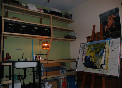
This wide asymmetrical image combines clutter and colour for aesthetic balance.
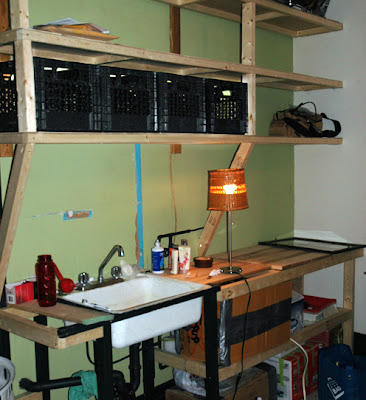
The dark lines of the easel mimic the angles of the light-coloured cedar frame construction, created over the sink. The light wood counters and shelves are against a darker shade than the easel which is against a white wall and that's given secondary importance by being allowed to merge with the dark wood bureau in the background. The traces of past art works present on the easel’s background also mimic the wires running around the counter and sink area. The leading lines created by the cedar shelves allow the eye to travel to the poster of the skinless horse and human rider (photo of art installation created by German artist-Gunther von Hagens) and to my landscape study (in progress) of analogous colours and palette knife techniques. The blue strip of sky within the acrylic painting echoes that on the wall where the green paint was pulled from the wall during construction to reveal a past tenants choice of the same shade of blue.
The technique is less purposeful composition and more aesthetic of archiving the passage of time and the changing spaces in which we share. I recently met the man who lived in my apartment for 25 years as a professional pinhole photographer (Andre Dubois) who developed many the images for other Montreal photographers from the 70's to the 90's. The nostalgia of living environments, and the onion layers of time, amaze me as I begin a new chapter to the black and white developing lab and studio within this special space.
Tuesday, February 27, 2007
Wednesday, February 21, 2007
Anaglyphs-concept of 3D
Description: This 3D image is originally done by Salvador Dali and converted into a anaglyph at www.jim3dlong.com and must be seen using coloured (red/green) glasses to achieve the desired effect of popping-out at the viewer.
Intentions: The graphic elements of the building being broken down into flying bullets and the organic melting circles of the watches counteract the linear lines to create a variety of forms that can feel above the stereo window (middle ground plane-place of focus) and the bullets and mountains seem to be below/lower than the stereo window.
Good/Bad: I'd like to see more dramatic effect of the space relationship by having the lower, right-hand side, melted watch pop-out more at the viewer. The graphic elements are very strong and help to pull the viewer into the image. The atmospheric sky is dramatic and allows the highlights to be muted and diffused over the buildings to be more realistic.
Evaluation: I feel that this system is very effective and I hope to experiment with anaglyphs and lenticular 3D photos in the near future. The title of the image is also that drew me in: "The disintegration of the persistence of memory," also reminds me of a Dali inspired drawing I finished in high school that featured a flooded city due to the tears of it's citizens.
Tuesday, February 20, 2007
Description- Major mounds of snow are falling in Montreal as we approach March. The snow removal force is out in full strength and here is a shot, from the inside of the much loved machines, as it clears snow from the IBM building on Rene-Levesque!
Intentions- I want to give the viewer a vantage point that is often seen only by the workers themselves. As well, as to accentuate the graphic elements of urban landscapes mixed with industrial mechanics.
Evaluate- the two dark leading lines created by the machine's window frame give a solid weight which draw the eye around the frame (to the feet first and then the exterior scene) and establishes the linear pattern repeated in the metal posts of the IBM bld.'s courtyard area. I tried multiple exposures to experiment with bringing out the detail in the blacks of the steering wheel area. I found that unless blending two images in PS the snow would continually blow-out if exposing for the inside of the machine.
Wednesday, February 14, 2007
Review of another's Classmates Work
Photo by Elise (Group 2) Prof. Photo Dept. at Dawson
Description: The broken edges around the frame remind me of archival images; Elise has a great description about her technique: "I then took my pictures and proceeded to cut off the white area of the picture while the emulsion was reacting. I then dipped them corner by corner or entirely in hot water and then in a concentrated stop bath (did it even have an effect?). To finish them off, I peeled off the back of the film and stuck it on foam core squares, leaving only the front protection sheet and the drying emulsion, since the developing process wasn't entirely finished, some parts of the picture didn't stick to the front layer, that's where the red part of the photos comes from."
Intentions: This was clearly an artistic experiment that has a lot of potential in creating a romantic aesthetic of soft-focused images where each Polaroid is unique due to the developing process. Are we moving back to Daguerreotypes where each metal plate developed is an original image which can't again be reproduced?
Works/doesn't work: The warm glow of the sunlight which is streaming through the window hits the clutter of green leaves and gives a texture to the image. The organic, natural shape created by the potted plant contrasts effectively with the straight-legged, linear table that falls of the frame in the background. I need a focal point and I find that the image would be stronger if my eye came to rest on a point of interest right now I keep searching the image for a pet or roommate. Maybe the absence of a subject allows the quality of light to be the focal point.
Evaluation: This medium close-up is a 'documentary' shot of the layout and light within Elise's apartment. I find the colour balance to be warm and inviting which is appealing, although I find my eyes tire of traveling the print and I want to rest on a focal point. This image is full of anticipation about what just happened or what may walk into the frame I see this being a poster on someone wall or within the editorial/home decor sections of a newspaper or magazine.
Tuesday, February 13, 2007
Burning Love on St. Catherine St. W.
I took the photo today starting at 10am when 5 fire truck sirens woke me from slumber. By noon the flames were really taking off, by 3pm the fire was fully under control with only one building gutted by the flames.
I was in a hurry to take each 200 frames that I shot this morning and was thinking in a more archival and documentary mode for capturing the images- since I didn't know when the action would end and how it was going to progress.
I'd like to put a series up, showing whomever is interested, how the fire progressed over the five hours of fire fighting. Although, for this assignment I've chosen this image because of it's ying-yang effect having one window fully engulfed and the other billowing with thick, grey smoke. I enjoyed the close-up view of the fire since this focal length allows the viewer to see what they couldn't in a wide establishing shot (which gives more context to the contents and is also efficient in getting the information across in a less intimate method). I choose an intimate shot to follow the Valentine’s burning love theme!
Wednesday, February 7, 2007
Holga Camera shots from Cuba
Description of image: The shot of Chez Guevara’s face is a contour representation that has been placed on the outside of a Cuban building (I think it's a hotel, although I'm not positive). The wide establishing shot gives the viewer a sense of space showing Guevara nestled within tuffs of the natural landscape. The metal frame which outlines the freedom fighter's face casts a large shadow on the left side of the buildings wall which pulls our eye to the flying flag from the top floors of the building. There's a high contrast ratio between the highlights of the white washed building, and the deep shadows with little detail in the thick palm trees and Cuban foliage, this creates a more dramatic effect to allow Guevara’s image to pop-out at the viewer.
Intentions of Photographer: To capture the play of shadows created by the wire-framed face, and experiment with the Holga camera to see the effect of the landscape pictured which is a high contrast scene.
What works and what doesn't work: The repeated patterns created by the buildings windows illustrate the logical compartmentalization of Western culture which is the opposite from the organic, and solar inspired sculpture of Guevara. The view-point would be more interesting if the photographer went closer and looked up at the sculpture or went from the roof and looked down.
Overall Evaluation: The vingetting created by the plastic lens is very appropriate to this image and helps to direct the viewers gaze towards the important focal point. This documentary style could be improved by furthur exploration of the environment to have foreground of foliage and background of Guevara- to mix two elements of organic nature.
{Side note: There's a small light leak at the bottom of the camera, it's possible that this Holga is an older version with a built-in flash, and the photographer has yet to plug the hole around the flash.}
Tuesday, February 6, 2007
what's black, white and read all over?
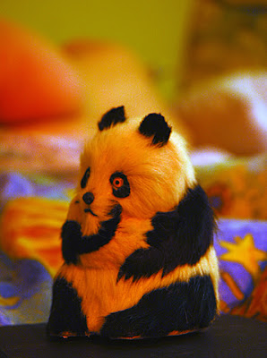
I've used tungsten light to create this shot and the main source was wrapped in a red gel. The fill light is diffused- due to being a frosted bulb. I find that the white light from the fill is almost as if it's falling through a window onto the subject.
I shot a series of images that varied the position of the background subject while trying to achieve a shallow focus that is the most efficient in creating a subtle, soft-focus and ambiguous background. A warm and maternally romantic image is what I was trying to achieve. The foreground object has a symbolic meaning of environmentalism and extinction, which is why I choose a red hue to spill over the scene. The placement of the foreground object is centered to give the audience the meaning that a portrait is taking place and the Panda is turned as if comtemplating the other subject it's sharing the frame with.
I have adjusted levels using photoshop to lighten dark areas and tone down the intensity of the red although this increased the blurred edged look- almost to posterization and I find this to be appealing to the shot.
Subscribe to:
Posts (Atom)